• This analysis was based on a challenge from the Codecademy Data Science skill path which involves looking at a huge bank of questions from the US game show, Jeopardy! It is a dataset that has probably been widely analysed, and like ‘Titanic Surivival’ and ‘Predicting House Prices’, it will have been seen plenty of times before. Nonetheless, I think it is interesting, and I found working on the challenge instructive.

    One of the given tasks is to create a function that will filter the questions based on specified terms. I created a ‘hard’ and a ‘soft’ version of this function – the former filters the questions so that they contain all the words in the given list of specified terms, the latter will return questions if they contain any of the terms in the list. This was achieved using the ‘all()’ and ‘any()’ methods respectively.

    We’ll start off by importing pandas and loading up the dataset. I will use pyplot later to create some visualizations.

    import pandas as pd
    import matplotlib.pyplot as plt

    pd.set_option(‘display.max_colwidth’, None)

    df = pd.read_csv(“jeopardy.csv”)
    df.describe()

    Next, the function definitions. We will call .lower() on ‘question’ and ‘word’ so that the comparison is case-insensitive. When checking a word, we add a space to the beginning and end to make sure that it is the actual word that is matched, and not a matching substring for another word. Without this, for example, the word ‘king’ might get unintentionally matched to any questions that included the word ‘viking’.

    def hard_filter_questions(df,word_list):
    filter = lambda question : True if all(” ” + word.lower() + ” ” in question.lower() for word in word_list) else False
    hard_filtered_df = df[df[‘Question’].apply(filter)]
    return hard_filtered_df

    def soft_filter_questions(df,word_list):
    filter = lambda question : True if any(” ” + word.lower() + ” ” in question.lower() for word in word_list) else False
    soft_filtered_df = df[df[‘Question’].apply(filter)]
    return soft_filtered_df

    word_list = [‘King’, ‘England’]
    hard_filtered_df = hard_filter_questions(df,word_list)
    soft_filtered_df = soft_filter_questions(df,word_list)

    print(len(hard_filtered_df))
    print(len(soft_filtered_df))

    51
    2313

    So we can already see there is a big difference in result depending on how we filter the dataset. Using the more stringent criteria results in a much narrower set of data, as you would expect. It goes to say as well, that if you only wanted to filter on one term, then it does not make a difference which version of the function you use. You could write a broader function, ‘filter_questions’, that takes an additional argument in the form of a Boolean value that will determine if a hard or a soft filter is performed. For example, if ‘hard_filter == True’ then run the comparison block that uses all(), else use the block that uses any(). The advantage of having the two seperate function definitions is that it is perhaps a bit clearer when looking at the code when a hard filter has been performed instead of a soft one.

    Next up, we wanted to perform some aggregate analysis on the ‘Values’ column. This contains the prize money value amount of each question, which supposedly is a measure of a question’s difficulty (as reward should be proportional to difficulty). In order to do this we first had to clean up the values. In their original form, they are represented as strings, with dollar values preceding the monetary values and comma delimiters for the larger values. These all need to be removed before we can convert to float. Again we use a lambda function with apply() on the target column.

    clean_value = lambda value : float(value.replace('$','').replace(',','')) if value != 'no value' else 0
    df['FloatValue'] = df['Value'].apply(clean_value)


    Now let’s compare the difficulty of questions about kings with questions about queens:

    king = ['King']
    king_df = hard_filter_questions(df,king)
    queen = ['Queen']
    queen_df = hard_filter_questions(df,queen)
    
    king_average_value = king_df.FloatValue.mean()
    queen_average_value = queen_df.FloatValue.mean()
    
    print(round(king_average_value,2))
    print(round(queen_average_value,2))
    
    806.97
    767.5

    So, on average, we think that King questions are a bit more difficult.

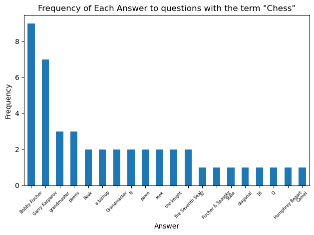
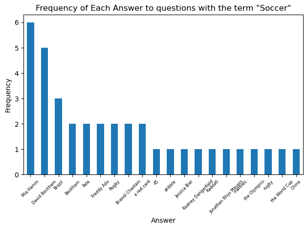
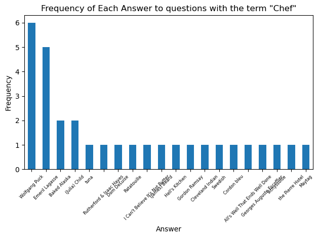
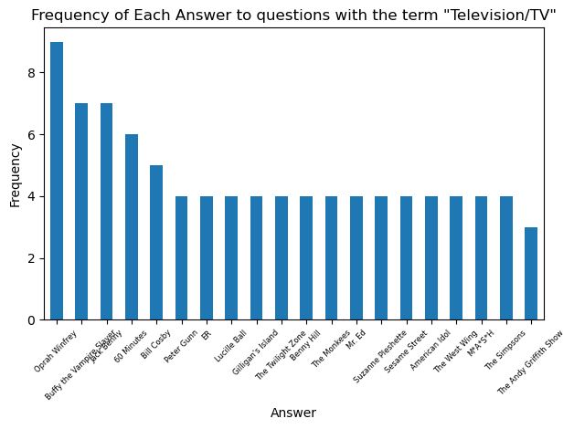
    The next task is to find the number of unique answers to questions inside a filtered dataset. Going back to the kings example, when asked questions about kings on the game show, are there certain answers that come up more often than others?

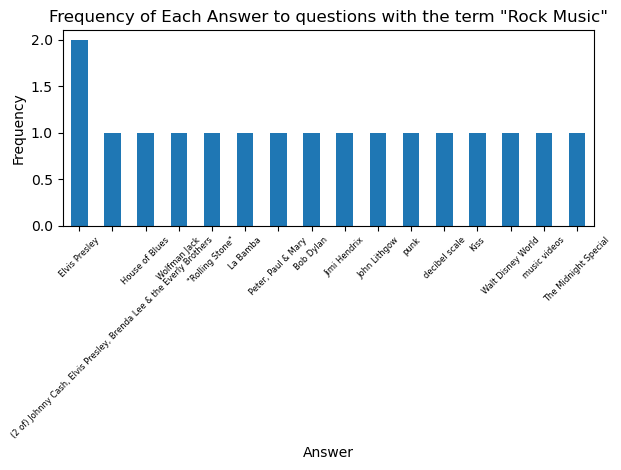
    The value_counts() method provides a perfect solution here. We can just define our ‘counts’ of unique answers to a filtered question bank as the value_counts() of the Answer column. I wrote two seperate functions that utilize the counts item. One of them simply prints a frequency count of each unique answer, the other one plots the frequency of answers as a bar chart (restricted to the 20 most frequent to keep the chart tidy)

    def get_unique_answers(filtered_df):
        counts = filtered_df['Answer'].value_counts()
        return counts
    
    def display_unique_answer_counts(counts):
        
        for answer, count in counts.items():
            print(f"{answer} : {count}")
    
    def plot_unique_answer_counts(counts,term):
        # plots the frequencies of the top 20 most common answers
        counts.head(20).plot(kind='bar')
        plt.xlabel('Answer')
        plt.ylabel('Frequency')
        plt.title(f'Frequency of Each Answer to questions with the term \"{term}\"')
        plt.xticks(rotation=45, fontsize = 6)  # Rotate labels 45 degrees and set the font-size so the labels don't overlap
        plt.tight_layout()       # Adjust layout so labels don’t get cut off
        plt.show()
    
    king_df = hard_filter_questions(df, ['King'])
    
    #display_unique_answer_counts(get_unique_answers(king_df))
    plot_unique_answer_counts(get_unique_answers(king_df), 'King')

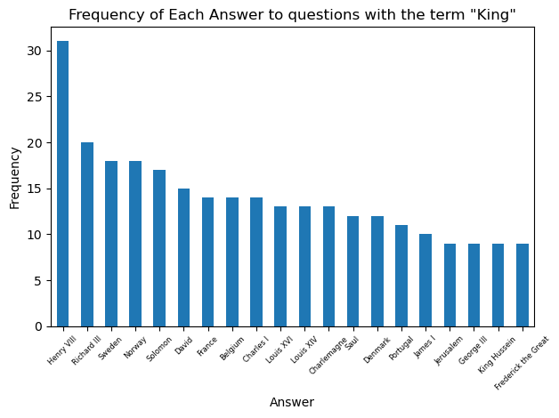
    So Henry VIII takes the prize as the king who is the solution to the greatest number of Jeopardy! questions. Let’s look at the most common answers for some other categories:

  • In the last post, we saw that Westminster was the worst London borough for crime in terms of total overall reported incidents. We thought it would be interesting to look at how the incidence of different crime types varied across the boroughs, to find out where more serious crimes are prevalent in the city. That is what we are going to look at today.

    Tools used:

    • SQL
    • R Studio
    • MS Excel

    First, I created a SQL query to obtain the table of interest:

    SELECT 
      borough,
      major_category,
      SUM(value)
    
    FROM bigquery-public-data.london_crime.crime_by_lsoa
    
    GROUP BY borough, major_category
    
    ORDER BY borough

    I uploaded the table to RStudio so that I could plot the incidence of crime by type for each borough. This is efficient, but admittedly the result does amount to visual overload:

    faceted_plot <- ggplot(crime_data_2, aes(x = major_category, y = f0_)) +
                             geom_col(fill = "steelblue") +
                             facet_wrap(~ borough) +
                             labs(
                                                 title = "Total reported crimes by category for each London borough during the period                                              2008–2016",
                                                 x = "Crime Category",
                                                 y = "Reported Crimes"
                                             ) + 
                             coord_flip() +
      
                             theme_minimal() 
    
    faceted_plot

    It is very difficult to read the labels. Westminster sticks out of course, with its Theft and Handling column. Looking at all the results in unison, it would appear to support the theory that increased incidence of theft and handling offenses are what make Westminster the worst overall borough for crime.

    What about other crime categories though? We were interested in looking at more dangerous and violent crimes, to identify the least safe areas of the city. To facilitate the comparison, we can filter the data to only include the worst offending boroughs. Let’s take the worst 10. For the period 2008 – 2016, these were identified in the previous analysis as:

    1. Westminster
    2. Lambeth
    3. Southwark
    4. Camden
    5. Newham
    6. Croydon
    7. Ealing
    8. Islington
    9. Tower Hamlets
    10. Brent

    We start by loading up the dplyr package:

    install.packages("dplyr")
    library(dplyr)
    
    ggplot(filter(crime_data_2, borough %in% c("Westminster", "Lambeth", "Southwark", "Camden", "Newham", "Croydon", "Ealing",
                                               "Islington", "Tower Hamlets", "Brent")), 
           aes(x = major_category, y = f0_)) +
      geom_col(fill = "steelblue") +
      facet_wrap(~ borough, scales = "free_x") +
      coord_flip() +
      labs(
        title = "Selected boroughs: reported crimes by category (2008–2016)",
        x = "Crime Category",
        y = "Reported Crimes"
      ) +
      theme_minimal()

    That is a big improvement. I think coord_flip(), which makes the bars horizontal, really helps in terms of making the labels more readable on the y-axis.

    What do we get from this? It does not look there are any particularly striking differences between the boroughs in terms of incidence of violent crime. Theft and handling is pretty even across the top 10 as well. Interesting to note that Sexual Offences actually appear to be very rare, my supposition would be that this is because rape and sexual assaults are grouped with the general violent crime category.

    To finish, then, let’s make some charts to determine which of the boroughs is the most violent.

    So Lambeth is actually worse for violent crime than Westminster, but not by that much. To finish, here is the chart with just the top 10:

    Lambeth at no.1 had a total number of reported violent incidents of 72726, while Hackney at no.10 had 56584. Perhaps a more startling statistic is that, given the total number of violent incidents reported across the city, there were on average 474 violent incidents reported each day during the 9 year period. Now I know London is big, but come on. Why can’t people be nice?

    Also interesting is that the top 10 worst boroughs for overall reported incidents are not the same as the top 10 worst boroughs for violent crimes. Camden, one of the worst boorughs for overall crime, is not amongst the most violent. Neither is Islington. On the other hand, violent crime was bad enough in Hackney and Lewisham to rank them amongst the 10 most violent.

  • I am from London, so I thought it might be interesting to find out how safe I am (well not really, because the data are quite out of date). Anyway.

    Tools Used:

    • SQL
    • RStudio
    • MS Excel

    I extracted the data from the publicly available datasets on Google’s BigQuery with SQL. Once I had tabulated the data of interest, I downloaded it as a .csv and brought it into RStudio to create my visualizations.

    The first question that came to mind was, which boroughs are associated with the worst crime rates? It would also be interesting to look at how crime rates have varied over time.

    There are 33 official London boroughs (or 32 + City of London if you want to be pedantic).

    Here is the query I used to get the table:

    SELECT 
      year,
      borough,
      SUM(value) AS total_crimes
    FROM bigquery-public-data.london_crime.crime_by_lsoa
    GROUP BY 
      year, borough
    ORDER BY 
       borough, year


    This returns a table with the total number of reported crimes for each borough, for each year 2008 – 2016.

    The next step was to upload the table to RStudio to create my viz. I would of course be using the ggplot2 package:

    install.packages("dplyr")
    install.packages("ggplot2")
    library(dplyr)
    library(ggplot2)

    Next I uploaded the crime data. For my first visualization, I wanted to find out which boroughs had the worst vs. best (or ‘least bad’) levels of crime. I would use a bar chart for this purpose:

    crime_data <- read.csv("london_crime_by_borough.csv")
    colnames(crime_data)
    
    total_crimes_by_borough <- crime_data %>%
         group_by(borough) %>%
         summarise(total = sum(total_crimes, na.rm = TRUE)) %>%
         arrange(desc(total))
    
    gplot(total_crimes_by_borough, aes(x = reorder(borough, -total), y = total)) +
              geom_bar(stat = "identity", fill = "steelblue") +
              labs(
                      title = "Total Reported Crimes by Borough (2008–2016)",
                      x = "Borough",
                      y = "Total Crimes"
                  ) +
              theme_minimal() +
              theme(axis.text.x = element_text(angle = 45, hjust = 1))


    The reorder method is great here for arranging the bars in descending order of size, which makes comparison an awful lot easier. Not too surprising that City of London had the least number of reported crimes (although, maybe it is a little surprising, given the data starts in the midst of the financial crisis. If the fraud’s big enough, and the suits are smart enough, perhaps it doesn’t count :P).

    Westminster then is by far the worst borough for crime. I decide I want to look into this further, but first, I wanted to answer the question about whether crime has got better or worse in London’s boroughs over time. Using the facet_wrap method, I efficiently created a plot for each borough with my original london_crime_by_borough table of values:


      ggplot(crime_data, aes(x = year, y = total_crimes)) +
                             geom_line(color = "darkred") +
                             facet_wrap(~ borough) +
                             labs(
                                                 title = "Reported Crimes Over Time by Borough (2008–2016)",
                                                 x = "Year",
                                                 y = "Reported Crimes"
                                             ) +
                             theme_minimal() +
                             theme(
                                 axis.text.x = element_blank(),
                                 axis.ticks.x = element_blank()
                             )

    So crime rates for all boroughs were pretty constant over the nine year period, with the exception of Westminster, when it got a bit worse in the middle for some reason. (Also, it looks like Tower Hamlets has been on a bit of a slow decline. Shame).

    Note that the final section theme(axis.text.x…) was used to remove the year labels from the x axis on each plot. This was because the labels were very cluttered and it just looked like a mess. I think it is evident enough how things changed (ok, did not change) over time.

    Why is Westminster the worst borough for crime?

    It is important to note that, we conceptualized our crime rate as the total number of reported crimes in any year. It is not to say that Westminster is particularly unpleasant or dangerous. It could be that there is just a high volume of petty crime in the area.


    The place is known as a bit of a tourist hotspot, and it hosts a thriving nightlife scene. As such, there is generally a higher footfall through the area, so it follows that the results for the reported crime statistics might be somewhat negatively skewed. Crime is something that people perpetrate against other people: more people = more crime.

    I created a SQL query to examine the number of reported crimes for Westminster by type:

      
    SELECT
      major_category,
      SUM(value) AS total_crimes
    FROM bigquery-public-data.london_crime.crime_by_lsoa
    
    WHERE borough = 'Westminster'
    
    GROUP BY 
      major_category
    ORDER BY
      total_crimes DESC;
    

    With the query results I then made a quick bar chart with Excel:

    So, the total number of reported crimes was driven heavily by theft and handling offenses.

    Let’s look at how reported theft and handling incidents compared for each of the other 32 boroughs. I made a new query with SQL and used Excel again to make a quick chart:

    SELECT 
      borough,
      SUM(value) AS total_crimes
    FROM bigquery-public-data.london_crime.crime_by_lsoa
    
    WHERE major_category = 'Theft and Handling'
    
    GROUP BY 
      borough
    ORDER BY 
      total_crimes DESC

    And you can see that once again, Westminster leads the way by far in this department.

    Follow-up considerations:

    It would be interesting to look at whether other types of crime are more prevalent in the Westminster area than in other boroughs. It was shown that Theft and Handling, which made up the majority of reported crimes in Westminster, was in fact much higher there than in the other boroughs. This might not be the only reason why Westminster is the worst borough for crime, though. It fits in with the ‘high footfall’ theory, as pickpocketing and opportunistic theft would fall in the theft/handling category.

    However, the present analysis leaves a lot to be desired. Westminster was the worst borough for crime, but only in terms of reported crime incidents – it is not necessarily the place with the worst crime, it is just the place that is associated with the most reported crime incidents. It could very well be the case that other, more serious crimes are more prevalent in some of other city boroughs (e.g. rape, murder), and this is something that the present analysis does nothing to reveal. Violent and sexual offenses in Westminster were actually shown to be relatively low as a proportion of overall reported incidents. The next question would be, where are the worst kinds of crime reported in the highest levels?

    Finally, as I pointed out at the start, the data is very old. It would be interesting to look at more recent statistics, to find out how our fair city is doing in terms of crime now. Have things got better or worse in the past nine years? You might say I should know, because I have been here the whole time. I am grateful to say that I have managed to get by unscathed (but should it be a surprise, you know what an introverted dork I am. Maybe I should get out more).

  • Today I embarked on analysing the top 50 Amazon bestselling books from 2009 – 2019. It is a well analysed dataset, but, as I love books, I thought it would be fun to have a look at it myself. I actually found some of the results quite surprising.

    Tools I used:

    -python pandas

    -MS Excel

    The dataset is not actually that large (550 records, duh), so a filtered and sorted spreadsheet would suffice to perform most of the analysis. Pandas would still prove useful for gathering and summarizing certain statistics.

    To start, I wanted to get straight down to which authors dominated the bestseller list during the eleven year period. The value_counts() function afforded by pandas would provide a quick and easy way of obtaining this. As the name suggests, this gives a count of each time a value appears in the specified column. We assign the result to ‘author_counts’, and use the head method to look at the first 10 rows:

    import pandas as pd
    
    file = pd.read_csv('amazon_top50_books.csv')
    df = pd.DataFrame(file)
    
    author_counts = df['Author'].value_counts()
    author_counts.head(10)
    Author
    Jeff Kinney 12
    Gary Chapman 11
    Rick Riordan 11
    Suzanne Collins 11
    American Psychological Association 10
    Dr. Seuss 9
    Gallup 9
    Rob Elliott 8
    Stephen R. Covey 7
    Stephenie Meyer 7

    Et voila. I actually didn’t know who half of these were! (Honestly). In my defence, once I looked people up, I can say at least I was aware of their work, and aware that it was in mainstream popularity. For anyone else who is in the dark, in descending order by rank these are:

    1. the author of the kids series ‘Diary of a Wimpy Kid’
    2. the author of the relationship guide, ‘The 5 Love Languages’
    3. the author of the young adult fantasy series, ‘Percy Jackson and the Olympians’
    4. the author of the young adult dystopian fantasy series, ‘The Hunger Games’
    5. the publisher of the APA style guide. Now, I was surprised by this one, as I actually studied psychology between 2011 – 2014, and I never needed to buy this! I did some research, and it turns out that an increasing number of disciplines outside of Psychology actually do use APA style for their academic publications. Many libraries and academic institutions are probably required to order it in bulk. And it got them to no.5 on the list (with a book that is probably as dry as hell). So there you go.
    6. Good old Dr Seuss! It is actually one book in particular, ‘Oh, the places you will go!’ that has done him proud, however ‘What pet should I get?’ did also win a place on the bestsellers list in 2015.
    7. publisher of ‘Strengthsfinder 2.0’
    8. the author of a couple of kids’ joke books
    9. the author of ‘The 7 habits of highly successful people’
    10. the author of the ‘Twilight’ series

    Now, it occurred to me that just because an author makes the most appearnaces on the bestsellers list, that does not necessarily make them the ‘best’ or most successful author. Many of the above are authors of a series, and have multiple entries that could potentially get them a place on the list.

    Going back to my spreadsheet, I determined that the highest user rating for any best seller was 4.9/5 (no such thing as a perfect ‘5’). The analysis now turns to which books were awarded the highest rating. In pandas, I created a new dataframe that filtered user rating by the identified top value 4.9. Some books received the top rating in multiple years, so I created another subset of that dataframe just to show the books that uniquely received the top score:

    top_rated_books = df[df['User Rating'] == 4.9]
    unique_top_rated_books = top_rated_books.drop_duplicates(subset=['Name'])
    
    print(unique_top_rated_books)
    
    40            Brown Bear, Brown Bear, What Do You See?        Bill Martin Jr.   
    81   Dog Man and Cat Kid: From the Creator of Capta...             Dav Pilkey   
    82   Dog Man: A Tale of Two Kitties: From the Creat...             Dav Pilkey   
    83   Dog Man: Brawl of the Wild: From the Creator o...             Dav Pilkey   
    85   Dog Man: Fetch-22: From the Creator of Captain...             Dav Pilkey   
    86   Dog Man: For Whom the Ball Rolls: From the Cre...             Dav Pilkey   
    87   Dog Man: Lord of the Fleas: From the Creator o...             Dav Pilkey   
    146  Goodnight, Goodnight Construction Site (Hardco...   Sherri Duskey Rinker   
    151                           Hamilton: The Revolution     Lin-Manuel Miranda   
    153  Harry Potter and the Chamber of Secrets: The I...           J.K. Rowling   
    155  Harry Potter and the Goblet of Fire: The Illus...          J. K. Rowling   
    156  Harry Potter and the Prisoner of Azkaban: The ...           J.K. Rowling   
    157  Harry Potter and the Sorcerer's Stone: The Ill...           J.K. Rowling   
    174                       Humans of New York : Stories        Brandon Stanton   
    187  Jesus Calling: Enjoying Peace in His Presence ...            Sarah Young   
    207  Last Week Tonight with John Oliver Presents A ...             Jill Twiss   
    219                                  Little Blue Truck         Alice Schertle   
    244                        Obama: An Intimate Portrait             Pete Souza   
    245                          Oh, the Places You'll Go!              Dr. Seuss   
    288  Rush Revere and the Brave Pilgrims: Time-Trave...          Rush Limbaugh   
    289  Rush Revere and the First Patriots: Time-Trave...          Rush Limbaugh   
    303             Strange Planet (Strange Planet Series)         Nathan W. Pyle   
    420               The Legend of Zelda: Hyrule Historia         Patrick Thorpe   
    431                                 The Magnolia Story            Chip Gaines   
    476                        The Very Hungry Caterpillar             Eric Carle   
    486                   The Wonderful Things You Will Be  Emily Winfield Martin   
    521                             Unfreedom of the Press          Mark R. Levin   
    545       Wrecking Ball (Diary of a Wimpy Kid Book 14)            Jeff Kinney

    So J.K. Rowling is still going strong. Interesting to note that a majority of these would appear to be childrens’ books!

    To finish, I thought it would be nice to do a visualization. I wanted to investigate with a bar chart how the popularity of fiction vs. non-fiction has changed over the eleven year period.

    First, I did a group by in pandas by year, then genre to get the aggregate statistics of interest:

    genre_counts_per_year = df.groupby(['Year', 'Genre']).size().unstack(fill_value=0)
    
    print(genre_counts_per_year)
    
    Genre  Fiction  Non Fiction
    Year                       
    2009        24           26
    2010        20           30
    2011        21           29
    2012        21           29
    2013        24           26
    2014        29           21
    2015        17           33
    2016        19           31
    2017        24           26
    2018        21           29
    2019        20           30

    Now, using this output, I created my visualization with a chart in MS Excel:

    And there you go! So, it looks like with the exception of 2014, the general trend is that non-fiction features somewhat more than fiction, but the difference is not that big.

    There are lots of reasons why you might expect this- people don’t just buy books for entertainment, which tends to be the primary purpose of fiction. Non-fiction books serve a variety of purposes, including entertainment but also study, instruction (food and cookery books come to mind), and self-help. A limitation of the dataset is that it only categorizes ‘genre’ in terms of whether a book is fiction or non-fiction. It would be interesting to look in depth at which subgenres (e.g., fantasy, crime, self-help, what have you) feature on the list. Part of the challenge of course is that identifying what genre a book falls into can be subjective, and people might have differing opinions on the matter.

    Follow-up considerations:

    • I thought it was interesting that there was a trend for the most highly rated books to be childrens’ books. Is there an explanation for that? Is it natural to assume that adult literature is just held up to a higher standard, and so you would expect the reviewers response to be more critical and harsh? Are childrens’ books genuinely just more enjoyable? Could it be because, a lot of childrens’ books are actually bought as gifts for children, and it is not actually the children themselves who give the ratings, but the adults, and their rating is distorted somewhat by the elevated response of their youthful recipient?
    • I noticed that all the authors considered were native english language authors. it turns out that this is because the data only considers the top selling english language titles! There are bestseller lists for other languages as well. It might be interesting to compare, and find out what the most popular titles in other languages are.
    • Could I attempt creating my own sub-categories in the original dataset, to look more specifically at what kinds of books dominated the list?
    • The data only goes up to 2019. It would be interesting to scrape data up to present date, to find out which books are now in vogue. Would we see that some of the top contenders have continued to hold their place?

  • 2025-07-04

    This week I got to grips with learning the ropes of the R programming language. I thought it might be instructive to play around with one of the sample datasets. I chose the economics dataset which is preloaded to the ggplot2 library.

    Let’s load up the dataset, and do some exploratory analysis:

    data("economics")
    head(economics)
    
    ## # A tibble: 6 × 6
    ##   date         pce    pop psavert uempmed unemploy
    ##   <date>     <dbl>  <dbl>   <dbl>   <dbl>    <dbl>
    ## 1 1967-07-01  507. 198712    12.6     4.5     2944
    ## 2 1967-08-01  510. 198911    12.6     4.7     2945
    ## 3 1967-09-01  516. 199113    11.9     4.6     2958
    ## 4 1967-10-01  512. 199311    12.9     4.9     3143
    ## 5 1967-11-01  517. 199498    12.8     4.7     3066
    ## 6 1967-12-01  525. 199657    11.8     4.8     3018
    

    I want to investigate how unemployment has changed over time. A line graph is a solid choice for looking at time series data.

    ts <- ggplot(data = economics, aes(x=date, y=unemploy)) + geom_line()
    mindate = min(economics$date)
    maxdate = max(economics$date)
    
    ts + labs(
      y = 'No. unemployed in thousands',
      title = 'A time series graph to show how unemployment has changed over time in the US',
      subtitle = paste('For the period ', mindate, ' - ', maxdate)
    )
    

    So it looks like unemployment has gone up a lot over the years. Bear in mind, however, that unemployment is quantified as a proportion of the working population, and of course the population of the US has increased a lot over time as well.

    You can tell from the chart that unemployment was at its lowest some time around 1968-1969, and peaked around 2009, before falling somewhat sharply. Let’s write some code to find out precisely when the high and low points were:

    min_row <- economics[which.min(economics$unemploy), ]
    max_row <- economics[which.max(economics$unemploy), ]
    
    print(min_row)
    
    ## # A tibble: 1 × 6
    ##   date         pce    pop psavert uempmed unemploy
    ##   <date>     <dbl>  <dbl>   <dbl>   <dbl>    <dbl>
    ## 1 1968-12-01  576. 201621    11.1     4.4     2685
    
    print(max_row)
    
    ## # A tibble: 1 × 6
    ##   date         pce    pop psavert uempmed unemploy
    ##   <date>     <dbl>  <dbl>   <dbl>   <dbl>    <dbl>
    ## 1 2009-10-01 9932. 308189     5.4    18.9    15352
    

    So, unemployment was nearly six times higher in 2009 vs 1968, while the population was only about 1.5 times higher. Interesting.

    I want to investigate further the relationship between the variables in the dataset. Let’s create a new variable for the unemployment rate, defined as the proportion of unemployed people in the population at any point in time, and look at the time series for that:

    library(dplyr)
    
    ## 
    ## Attaching package: 'dplyr'
    
    ## The following objects are masked from 'package:stats':
    ## 
    ##     filter, lag
    
    ## The following objects are masked from 'package:base':
    ## 
    ##     intersect, setdiff, setequal, union
    
    economics <- economics %>%
      mutate(unemploy_rate = unemploy / pop)
             
    ggplot(data=economics, aes(x=date, y=unemploy_rate)) +
      geom_line() +
      labs( y = 'Unemployment rate (as unemployed/population)',
            title = 'A time series graph to show how the unemployment rate has changed over time in the US')
    
    min_row_rate <- economics[which.min(economics$unemploy_rate), ]
    max_row_rate <- economics[which.max(economics$unemploy_rate), ]
    
    print(min_row_rate)
    
    ## # A tibble: 1 × 7
    ##   date         pce    pop psavert uempmed unemploy unemploy_rate
    ##   <date>     <dbl>  <dbl>   <dbl>   <dbl>    <dbl>         <dbl>
    ## 1 1968-12-01  576. 201621    11.1     4.4     2685        0.0133
    
    print(max_row_rate)
    
    ## # A tibble: 1 × 7
    ##   date         pce    pop psavert uempmed unemploy unemploy_rate
    ##   <date>     <dbl>  <dbl>   <dbl>   <dbl>    <dbl>         <dbl>
    ## 1 1982-12-01 2162. 233160    10.9    10.2    12051        0.0517
    

    It looks exactly the same as the previous chart! Should that have been a surprise?

    Using some help from ChatGPT, I will create a plot that shows both lines on the same time series graph to investigate further:

    library(tidyverse)
    
    ## ── Attaching core tidyverse packages ──────────────────────── tidyverse 2.0.0 ──
    ## ✔ forcats   1.0.0     ✔ stringr   1.5.0
    ## ✔ lubridate 1.9.2     ✔ tibble    3.2.1
    ## ✔ purrr     1.0.2     ✔ tidyr     1.3.0
    ## ✔ readr     2.1.4     
    ## ── Conflicts ────────────────────────────────────────── tidyverse_conflicts() ──
    ## ✖ dplyr::filter() masks stats::filter()
    ## ✖ dplyr::lag()    masks stats::lag()
    ## ℹ Use the conflicted package (<http://conflicted.r-lib.org/>) to force all conflicts to become errors
    
    economics <- economics %>%
      mutate(
        unemploy_rate = unemploy / pop,
        unemploy_scaled = scale(unemploy)[,1],
        rate_scaled = scale(unemploy_rate)[,1]
      )
    
    econ_long <- economics %>%
      select(date, unemploy_scaled, rate_scaled) %>%
      pivot_longer(cols = -date, names_to = "variable", values_to = "value")
    
    ggplot(econ_long, aes(x = date, y = value, color = variable)) +
      geom_line(size = 1) +
      labs(title = "Scaled Comparison: Unemployed Count vs. Unemployment Rate",
           y = "Standardized Value",
           color = "Variable") +
      theme_minimal()
    
    ## Warning: Using `size` aesthetic for lines was deprecated in ggplot2 3.4.0.
    ## ℹ Please use `linewidth` instead.
    ## This warning is displayed once every 8 hours.
    ## Call `lifecycle::last_lifecycle_warnings()` to see where this warning was
    ## generated.
    

    So even though the times series for the two variables have the same shape, you can see that they are not exactly the same.

    The scale function is applied to both variables to make a meaningful comparison on the y-axis. It works by converting the values for each variable to z scores (so the mean for each set is 0 and the standard deviation is 1).

    To finish off my analysis for today, I will create some time-series graphs for the other variables in the dataset. I had to look up what some of these were:

    pce = personal consumption expenditures, essentially a measure of how much households are spending at any given point in time. It is another commonly used measure of economic health.

    psavert = personal savings rate, i.e. the percentage of disposable (afer-tax) personal income that people save rather than spend

    uempmed = median duration of unemployment, measured as the median number of weeks that people remained unemployed

    ts_pce <- ggplot(data = economics, aes(x=date, y=pce)) + geom_line()
    mindate = min(economics$date)
    maxdate = max(economics$date)
    
    ts + labs(
      y = 'Personal savings rate',
      title = 'A time series graph to show how PCE has changed over time in the US',
      subtitle = paste('For the period ', mindate, ' - ', maxdate)
    )
    
    ts_psavert <- ggplot(data = economics, aes(x=date, y=psavert)) + geom_line()
    mindate = min(economics$date)
    maxdate = max(economics$date)
    
    ts + labs(
      y = 'Personal consumption expenditures',
      title = 'A time series graph to show how personal savings rate has changed over time in the US',
      subtitle = paste('For the period ', mindate, ' - ', maxdate)
    )
    
    ts_uempmed <- ggplot(data = economics, aes(x=date, y=uempmed)) + geom_line()
    mindate = min(economics$date)
    maxdate = max(economics$date)
    
    ts + labs(
      y = 'Median duration of unemployment in weeks',
      title = 'A time series graph to show how duration of unemployment has changed over time in the US',
      subtitle = paste('For the period ', mindate, ' - ', maxdate)
    )
    

    All these charts look the same! Let’s apply the method we used earlier to investigate:

    library(tidyverse)
    
    economics <- economics %>%
      mutate(
        unemploy_scaled = scale(unemploy)[,1],
        pce_scaled = scale(pce)[,1],
        psavert_scaled = scale(psavert)[,1],
        uempmed_scaled = scale(uempmed)[,1]
      )
    
    econ_long <- economics %>%
      select(date, unemploy_scaled, pce_scaled, psavert_scaled, uempmed_scaled) %>%
      pivot_longer(cols = -date, names_to = "variable", values_to = "value")
    
    ggplot(econ_long, aes(x = date, y = value, color = variable)) +
      geom_line(size = 1) +
      labs(title = "Scaled Comparison of the Economics Dataset variables",
           y = "Standardized Value",
           color = "Variable") +
      theme_minimal()
    

    So, the scaled charts actually look very different! How about that. I was especially surprised at how the pce_scaled line turned out.

    Follow-up considerations:

    • The dataset points from the economics dataset only go up to 2015. How would the charts look if we had data all the way up to present date?
    • The economics dataset only considers the economy of the USA. How would economic data from other countries look in comparison?
    • Unemployment and other economic indicators have obviously fluctuated quite willdy over the past 50 odd years. What factors have influenced these fluctuations? Do we still see the same patterns when we look at the economic data of other countries? How can we analyse the impact of global events on nations’ economic health and stability? Can economic downturns and expansions be localized to a single nation’s economy? Could it be the case that the economic performance of some nations is more closely to specific nations than others?

  • Hi everyone, this blog is going to be for my data portfolio. I will showcase here what I have learned about the wonderful field of Data Science. Stay tuned for updates!